IDI Cafe
Branding & UI
Defining the Brand
IDI, translating to 'Idea' in Italy, is a cafe that embraces a passion for knowledge and innovation. The cafe is an Italian style cafe which meant the brand had to embody a bright and sleek design.

Brand Values
Inclusivity
&
Individuality
Curiosity
&
Creativity
Inspiration
&
Innovation
Productivity
&
Progression
Logo
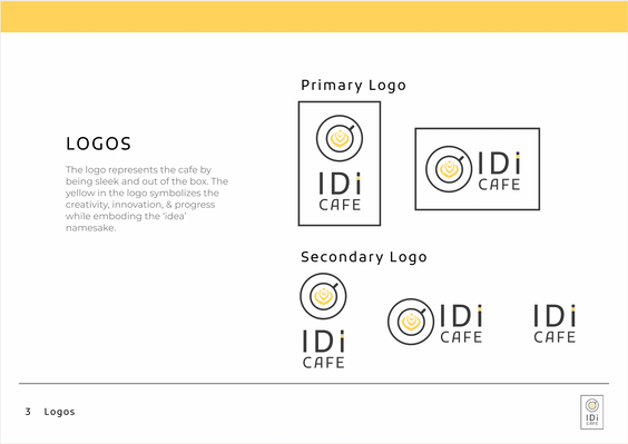
The logo represents the cafe by being sleek and out of the box. The yellow in the logo symbolizes the creativity, innovation, & progress while emboding the ‘idea’ namesake.


In Context
Logo can be used with dark backgrounds as well.
Formal settings such as business cards will feature a dark background with a white and yellow logo to slightly diverge from the playful tone in more serious settings such as asking for business loans.
User Personas
User research was conducted to create User Personas for Idi Cafe app's target market. Research deemed the following 4 main personas to be most likely to order and use the app.

Information Architecture
Once our target demographics, observation analysis and basic requirements were established, I was able to create the structural map (Information Architecture) to organize the different pages, hierarchy and content.

Early Wireframes


Interactive Early Prototype
Check out the interactive early prototype below or see the original file.


